Wednesday, 16 February 2011

Evaluation Planning

We have decided to style our evaluation in a way similar to a special feature on a dvd. We will sit in front of the camera talking about our music video. To make it more interesting we will overlay some key clips from the music video while we talk about them. After looking at what we have done so far and the premise of the task we have come up with the following key elements which we will discuss:


  • The conventions we made use of

  • Any unconventional features

  • How we made use of Goodwin's 6

  • The way in which we combined the main product with the ancillary tasks

  • How we created a "Brand" for the artist

  • How we made use of Audiance feedback for all parts of the task

  • How we collected our audiance feedback

  • the ways in which we made use of technology

  • The changes we would make if we made the product again

These points will be posed as questions by members of the audience directly to me and Andy. We will also gather some clips of the audience's reactions to our music video which will be included in our evaluation. To create a fairly topical backdrop to our evaluation made a large scale print out of the front cover of our digipack which consists of 9 A3 sheets of paper which have been trimmed down and stuck together:


Sunday, 13 February 2011

Completed Website

This is the link to our completed website.

www.wix.com/andyw1992/BFMVMedia

I have checked the links and all the pages are working.

Website 'Merchandise' Page

This is our fifth page for our website tittled 'Merch'.


For this page I created some merchandise items for sale by photo-shoping the digipack front cover and Bullet For My Valentine logos onto T-shirts and guitar picks. I added quick description of each item as well as a price.

Website 'Band Photos' Page

This is the complete fourth page of our website tittled 'Band Photos'.


For this page I added a tittle to show that these were the photos taken during the making of the 'Dignity Music Video' but shortened to just 'Dignity'.

I added the photos in a three by two matrix viewer and added a total of 24 photos meaning there are four different pages for a user to browse through and look at. Unfortunately the matrix could not be re sized so to fill the space either side of the viewer I added a copy of the silhouette roses to each side. The matrix allows user to browse smaller thumbnails of each photo and then click on each to make full screen.

The photos used where a mixture of serious ones of the band performing, individual photo shoot pictures, and some fun photos from the making of the music video. This mixture of types of photo will although users to see different sides to the band.

Website Media Page

This is the complete third page of our website tittled media.


For this page I added a music player to the top of the page which the user can select one of five different Bullet For My Valentine songs. I also added a tittle for music videos of the band, however as we have only created the 'Dignity' music video, the other video has been replaced with 'Coming Soon'. This creates a further advertising for our music video as it is viewable on the home page as well as this separate 'Media' page.

I decided not to added any photos to this page as I didn't feel it was required and would draw attention away from the music player.

Website News Page

Here is the complete second page of our website which is titled "News".


I added a "Latest News" title in the same font and color as the title from the home page, this helps to keep consistency throughout the website and will make it look more refined and clean.

I added two images to this page along with some news about the band that I have come up with. For example the text states "Bullet For My Valentine are currently preparing to headline a massive European tour...tour dates and venues coming soon". This would keep our target audience interested as they would repeatedly come back to the website to check to see if the tour dates have been released.

I also made sure that the two images on the page fit with the text around them, the picture of the band below the "tour dates", and the picture of the fire letters of BFMV above the announcement of the music video release. I choose the BFMV fire letters as the second image for this page because it was present in the music video itself which fits with the text below the image.

Changes to Website home page


As you can see above, I had to change the background image for the website. This was because I was told that the original image was not really appropriate as it is was such a large image that was not of our own creation. I replaced it with a photo we took of the three guitars leaning up against the drums. Unfortunately as this image was brighter than the original background I had to make it more transparent, letting some of the black background show through which I think now works well. Also, because of the colour of this new image, I had to change the red writing to white because it was too difficult to read on the new background.

Thursday, 10 February 2011

Home Page of website

Here is my design so far for the front or homepage of our website:

I added an embed for our music video to the front page, as well as a advertisement for the digipack with the picture of the front cover of the digipack.

I also added black guns firing out black roses to each edge of the page as these are signature images of the band.

I also added a navigation bar which allows the user to switch pages on the website.

I included a couple of details about the band like upcoming tour dates and a bio, and added the publisher's logo to the corner of the page which you would expect to see on a real band website.

Through the page I stuck to the same colours of dark greys, reds, blacks and whites as these colours are stereotypically representative of the genre of music our music video is.

Monday, 7 February 2011

Finished Music Video

This is our final version of our music video.


Below are some of the changes we made from our draft to this version:

  • We added the titles to the beginning of the video, placing in the bottom left hand corner which is where they are most commonly found on music videos.
  • We shortened the intro, removing the opening shot of the truck and close up shot of the man's boot as these were very similar to first shots of the army officer in the main narrative which lead to confusion over the identity of the man pouring the petrol in the beginning. We wanted to leave it ambiguous as to whether or not it was the army officer.
  • We rearranged the shots of the fire igniting to fit in more with the quick pace of the beginning of the song.
  • We increased the scale on some performance shots to remove some unnecessary open space around the band.
  • We moved a couple of performance shots by a couple of frames to make sure the audio to visual sync was as accurate as possible.
  • We added a gunshot to ending narrative, this was done by overlaying an image of a muzzle flash for a couple of frames at the same time as making the video flash brighter.
  • We also trimmed a couple of narrative shots so they would fit better with the pace of the music.

Saturday, 5 February 2011

Finished Digipack

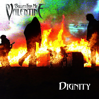
The digipack element of the ancillary taks is now complete. I have combined the different sides by using the template downloaded from http://www.discwizards.com/cd-dvd-artwork-templates.htm . Additionally I have made a few adjustments to the front cover image and made a strip for the side, using part of one of the earlier images. For the new front cover I have used an a template of the bands actual font which was selected while on a transparent background and paste onto the image.


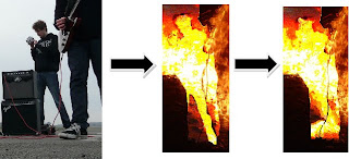
I have also done some more work concealing the part of the image containing Andy filming the band. This was done by copying and pasting small chunks from other parts of the fire to smooth out the edges around him.


The final product:


Front cover:


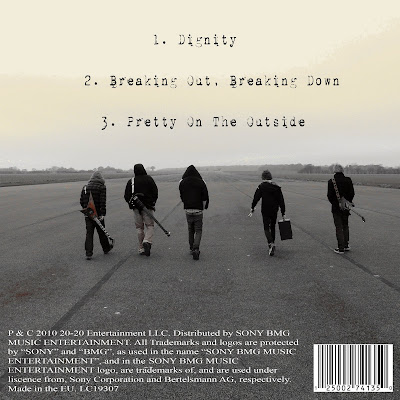
Back Cover:


Inside left:


Inside right:

Friday, 4 February 2011

Digipack Design- Inside Right

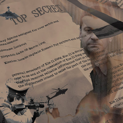
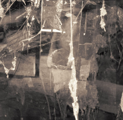
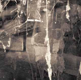
In my research I found that for the most part the inside panels of albums and digipacks are reasonably plane. This has inspired me to go with a fairly simple design for the last element of my digipack, the inside right cover. I have again based the image on the narrative of the video. This time a shot taken during the filming of the torture scene has been used:


To make this image more subtle we have decided to combine it with an image of some cobwebs which was taken in the same location:


To combine these two layers we used a blending option known as "screen" this gives the background an almost "ghostly" quality to it. I feel that this as well as the cobweb element hints at the nostalgia of the image. This helps it to link in with our music video since the torture part of the narrative was set in the past. As a final touch I have added a sepia tone effect to maintain consistency with most of the other images:


I am now in the process of collating the four images I have made to form the final product and will present it when it is complete.