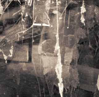
To make this image more subtle we have decided to combine it with an image of some cobwebs which was taken in the same location:

To combine these two layers we used a blending option known as "screen" this gives the background an almost "ghostly" quality to it. I feel that this as well as the cobweb element hints at the nostalgia of the image. This helps it to link in with our music video since the torture part of the narrative was set in the past. As a final touch I have added a sepia tone effect to maintain consistency with most of the other images:

I am now in the process of collating the four images I have made to form the final product and will present it when it is complete.
No comments:
Post a Comment