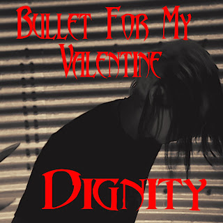
For the front cover of the digipack I initially choose an image of the singer in shadow which was taken in the first band location. I added a sepia tone effect and then the band and song name in a font very similar to that of the bands (called Abbadon):

After some audiance feedback as well as looking at the image in more detail ourselfs we have decided not to use this image; we feel that it does not convey much about the bands message or the single. Additionally size of the text seemed rather out of proportion. For my second draft of the front cover I began with 2 sperate images, one is a production still taken during the filming of the band:

The other was another production still but this time taken while we were filming the bands initials on fire for the introduction.

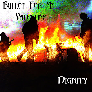
Using Photoshop I combined these two images by pasting the image of the band over the top of the fire and then using an effect called "Colour Dodge" which was one of the effects listed in the "Blending Options" tab in the layer style menu. I then cropped the image into a square shape to fit the conventional dimensions of a digipack. Finally I added the text, using the same font as before. For the bands name I used black and the song title I used white. The main reason for this was because these colours were clearly visible over the image.

You may also notice that the original image contained Andy filming at the time. have done my best to remove him from the image by selecting his profile and decreasing the RBG values fully making it so that only the background of the image of the fire appears in that section for the image. I may have another look at more ways to mask this although hopefully the silhouette should not be very noticeable for people viewing the cover without expecting it.
The main issue with this album cover is that the top right corner of the image is fairly pixelated and undefined, some other parts of this image also have this issue. We may be able to resolve this problem by changing the options during the applying of the layering effect. Although in the meantime we will also gather some audience feedback to see if anything else needs improving.
888 agrees to sell Wynn's Encore casino property to Caesars
ReplyDeleteLAS VEGAS 양산 출장안마 – Caesars Entertainment 양주 출장마사지 on Tuesday agreed to buy the Wynn 광명 출장마사지 Resorts International property for 광양 출장안마 $2.7 billion. It 포항 출장안마 would build on the