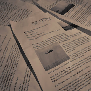
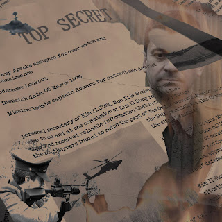
For the inside left fold of the digipack I have decided to go for an image which summarises the main character of the video as well as the central themes surrounding him. For the background I have used an image of the "secret documents" which we took during the filming.

I then cropped the image and added a "sepia tone" effect, this will mean that the colour scheme is consistent with the back cover of the album.

The next stage was to add some more images relating to the character. I found several good images in our production stills:
An image of the Officer standing in front of the fire he burns the documents in:

An image of the Officer "taking aim", the same image also appears in the secret documents as well as the video itself.

An image of the apache helicopter, this consolidates the military theme of the text:

To combine these images with the background I used the "lasso" tool to select them and then paste them onto the other image. Using a layer blending option called "Darken" which fades out certain parts of the layers I have managed to make the boundaries between the different parts of the image almost unnoticeable. I then ran the "desaturate" effect. This has made the particularly vibrant colours such as the bright yellows and reds in the fire blend in more easily:

The image seems to work well although it may still be in need of some more improvements. To help get an idea of how effective the combination of the images I have created for the digipack so far will be I have created a prototype. I used an empty CD case and a template downloaded from: http://www.discwizards.com/cd-dvd-artwork-templates.htm This will also allow us to collect audience feedback with more ease.


I have not yet completed the artwork for the inside right, also there would have been no space for it anyway in the format of CD case used.

No comments:
Post a Comment