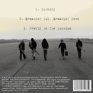
I think it is a very good image because the band are the center as the landscape fades into the distance. Since it is already a very good image I have only made a few slight adjustments. Using the program "Paint Shop Pro 8" I added a "Sepia tone" effect which I feel makes the image more refined.
The rest of the editing was done in photoshop however this was mainly used to add the text. For the tracklisting I used the same font which was used for the secret documents, this is another font downloaded online which is known as "1942 typewriter". For my initial draft I have decided to present the digipack in the style of an EP using 3 track names from the album which our song is on. As well as "Dignity", I have also listed, "Breaking Out, Breaking Down" and "Pretty On The Outside" which are two more fairly strong tracks from the album "Fever".
The next 2 features added were two more conventional elements of a digipack, the barcode and the copyright information. For now I have copied the copyright information of the back of the bands 2008 album "Scream, Aim, Fire" changing the date in the process, this should provide a sufficiently accurate representation of what the band would have on the back of an EP. The barcode was rather simply found on Google images, however it certainly looks the part.

No comments:
Post a Comment