Here is our completed evaluation. We hope we have explained the making of our music video to it's fullest. We also have some audience feedback towards the finished music video at the end of this video.
Tuesday 8 March 2011
Wednesday 2 March 2011
Editing The Evaluation
We are now very close to completing our evaluation. We begin the piece with a short introduction spoken by us to the camera. After this we have made our own opening sequence which includes a selection of clips from our music video. The soundtrack to this sequence is part of the song "Fever" by Bullet For My Valentine, this track features on the same album as "Dignity" so we feel it ties in well with the media product as a whole. Once the opening sequence finishes we have decreased the audio level of the "Fever" to about -30dB, It continues to play underneath us talking at around this level for the until it finishes. Throughout the course of the evaluation we have also used several other songs playing in the background, these are:
- Trivium-"The Crusade"
- Unearth-"Big Bear And The Hour Of Chaos"
- Lamb Of God-"In Your Words"
- Metallica-"Suicide And Redemption"
We have chosen these tracks for two main reasons, firstly because they all fit within the "Metal" genre meaning that they associate well with our product and secondly because "The Crusade", "Big Bear And The Hour Of chaos" and "Suicide And Redemption" are all instrumental tracks meaning that they do not detract too much from the entire product. We feel that the background music works well because it adds more depth to the soundtrack as a whole; additionally it makes it similar to the style of many real life interviews with artists and similar figures where the production company often chooses to have music by or similar to the artist in question playing in the background. To make the title during the opening sequence we used "Live Type", we found this very useful since we were able to pick out a font similar to that used on the back of our digipack, this increases the synergy between our media products and evaluation.
Following the opening sequence we have chosen to fade straight into the first of our questions. We initially planned to have the question come up as a title on the screen however we thought it would be a lot more interesting if the questions were posed by actual people. As a result of this we filmed members of the audience (and some of the band members) asking the questions while standing up against a plain background. Each of the questions is then answered by me and Andy. As the question is discussed we have overlaid clips from the music video relating to the topic at hand. For each individual clip we have had to unlink the audio and video of the discussion and then remove me and Andy by using the split-clip tool. We have then dragged the clip from the video down into the timeline with its audio laying in the same track as the soundtrack; cross dissolves are then added to each end of the clip. One thing which we found was that the transition between the video of us talking and the music video did not work when the soundtrack audio cut suddenly into the song, we used the keyframe function to make the audio levels of the soundtrack fade down to -∞ dB just before the song fades in. We have tried to add as many clips relating to the discussion as possible, although at times it has been difficult to find things especially since the evaluation is approximately 30 minutes long.
In addition to clips from the music video we have also overlaid stills relating to the digipack and website. These have been slotted into the timeline in a similar way to the video clips making use of cross dissolves. This type of transition has been particularly useful for showing the development of the digipack. While talking about the digipack we overlaid the original image used for the front cover and then dissolved into the same image combined with the fire before dissolving into the image of the final digipack.
At the end of the evaluation we have added some clips of the audience members talking about their opinions on the video; these were taken at the same time as we filmed the questions. After each piece of audience feedback we cut to part of our music video before cutting to another person. We have then finished the video by cutting back to us saying that it is then end of the piece, we have then added a few more seconds of the video before fading out both the video and audio. We believe the fade out at the end works well because it makes it less sudden as well as more interesting.Wednesday 16 February 2011
Evaluation Planning
We have decided to style our evaluation in a way similar to a special feature on a dvd. We will sit in front of the camera talking about our music video. To make it more interesting we will overlay some key clips from the music video while we talk about them. After looking at what we have done so far and the premise of the task we have come up with the following key elements which we will discuss:

- The conventions we made use of
- Any unconventional features
- How we made use of Goodwin's 6
- The way in which we combined the main product with the ancillary tasks
- How we created a "Brand" for the artist
- How we made use of Audiance feedback for all parts of the task
- How we collected our audiance feedback
- the ways in which we made use of technology
- The changes we would make if we made the product again
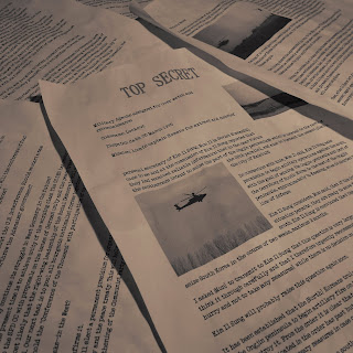
These points will be posed as questions by members of the audience directly to me and Andy. We will also gather some clips of the audience's reactions to our music video which will be included in our evaluation. To create a fairly topical backdrop to our evaluation made a large scale print out of the front cover of our digipack which consists of 9 A3 sheets of paper which have been trimmed down and stuck together:

Sunday 13 February 2011
Completed Website
This is the link to our completed website.
www.wix.com/andyw1992/BFMVMedia
I have checked the links and all the pages are working.
www.wix.com/andyw1992/BFMVMedia
I have checked the links and all the pages are working.
Website 'Merchandise' Page
This is our fifth page for our website tittled 'Merch'.

For this page I created some merchandise items for sale by photo-shoping the digipack front cover and Bullet For My Valentine logos onto T-shirts and guitar picks. I added quick description of each item as well as a price.

For this page I created some merchandise items for sale by photo-shoping the digipack front cover and Bullet For My Valentine logos onto T-shirts and guitar picks. I added quick description of each item as well as a price.
Website 'Band Photos' Page
This is the complete fourth page of our website tittled 'Band Photos'.

For this page I added a tittle to show that these were the photos taken during the making of the 'Dignity Music Video' but shortened to just 'Dignity'.
I added the photos in a three by two matrix viewer and added a total of 24 photos meaning there are four different pages for a user to browse through and look at. Unfortunately the matrix could not be re sized so to fill the space either side of the viewer I added a copy of the silhouette roses to each side. The matrix allows user to browse smaller thumbnails of each photo and then click on each to make full screen.
The photos used where a mixture of serious ones of the band performing, individual photo shoot pictures, and some fun photos from the making of the music video. This mixture of types of photo will although users to see different sides to the band.
Website Media Page
This is the complete third page of our website tittled media.

For this page I added a music player to the top of the page which the user can select one of five different Bullet For My Valentine songs. I also added a tittle for music videos of the band, however as we have only created the 'Dignity' music video, the other video has been replaced with 'Coming Soon'. This creates a further advertising for our music video as it is viewable on the home page as well as this separate 'Media' page.
I decided not to added any photos to this page as I didn't feel it was required and would draw attention away from the music player.
Website News Page
Here is the complete second page of our website which is titled "News".

I added a "Latest News" title in the same font and color as the title from the home page, this helps to keep consistency throughout the website and will make it look more refined and clean.
I added two images to this page along with some news about the band that I have come up with. For example the text states "Bullet For My Valentine are currently preparing to headline a massive European tour...tour dates and venues coming soon". This would keep our target audience interested as they would repeatedly come back to the website to check to see if the tour dates have been released.
I also made sure that the two images on the page fit with the text around them, the picture of the band below the "tour dates", and the picture of the fire letters of BFMV above the announcement of the music video release. I choose the BFMV fire letters as the second image for this page because it was present in the music video itself which fits with the text below the image.
Changes to Website home page

As you can see above, I had to change the background image for the website. This was because I was told that the original image was not really appropriate as it is was such a large image that was not of our own creation. I replaced it with a photo we took of the three guitars leaning up against the drums. Unfortunately as this image was brighter than the original background I had to make it more transparent, letting some of the black background show through which I think now works well. Also, because of the colour of this new image, I had to change the red writing to white because it was too difficult to read on the new background.
Thursday 10 February 2011
Home Page of website
Here is my design so far for the front or homepage of our website:
 I added an embed for our music video to the front page, as well as a advertisement for the digipack with the picture of the front cover of the digipack.
I also added black guns firing out black roses to each edge of the page as these are signature images of the band.
I also added a navigation bar which allows the user to switch pages on the website.
I included a couple of details about the band like upcoming tour dates and a bio, and added the publisher's logo to the corner of the page which you would expect to see on a real band website.
Through the page I stuck to the same colours of dark greys, reds, blacks and whites as these colours are stereotypically representative of the genre of music our music video is.
Monday 7 February 2011
Finished Music Video
This is our final version of our music video.
Below are some of the changes we made from our draft to this version:
Below are some of the changes we made from our draft to this version:
- We added the titles to the beginning of the video, placing in the bottom left hand corner which is where they are most commonly found on music videos.
- We shortened the intro, removing the opening shot of the truck and close up shot of the man's boot as these were very similar to first shots of the army officer in the main narrative which lead to confusion over the identity of the man pouring the petrol in the beginning. We wanted to leave it ambiguous as to whether or not it was the army officer.
- We rearranged the shots of the fire igniting to fit in more with the quick pace of the beginning of the song.
- We increased the scale on some performance shots to remove some unnecessary open space around the band.
- We moved a couple of performance shots by a couple of frames to make sure the audio to visual sync was as accurate as possible.
- We added a gunshot to ending narrative, this was done by overlaying an image of a muzzle flash for a couple of frames at the same time as making the video flash brighter.
- We also trimmed a couple of narrative shots so they would fit better with the pace of the music.
Saturday 5 February 2011
Finished Digipack
The digipack element of the ancillary taks is now complete. I have combined the different sides by using the template downloaded from http://www.discwizards.com/cd-dvd-artwork-templates.htm . Additionally I have made a few adjustments to the front cover image and made a strip for the side, using part of one of the earlier images. For the new front cover I have used an a template of the bands actual font which was selected while on a transparent background and paste onto the image.

I have also done some more work concealing the part of the image containing Andy filming the band. This was done by copying and pasting small chunks from other parts of the fire to smooth out the edges around him.
The final product:
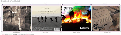
Front cover:
Back Cover:
Inside left:
Inside right:
I have also done some more work concealing the part of the image containing Andy filming the band. This was done by copying and pasting small chunks from other parts of the fire to smooth out the edges around him.

The final product:

Front cover:

Back Cover:

Inside left:

Inside right:

Friday 4 February 2011
Digipack Design- Inside Right
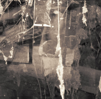
In my research I found that for the most part the inside panels of albums and digipacks are reasonably plane. This has inspired me to go with a fairly simple design for the last element of my digipack, the inside right cover. I have again based the image on the narrative of the video. This time a shot taken during the filming of the torture scene has been used:

To make this image more subtle we have decided to combine it with an image of some cobwebs which was taken in the same location:

To combine these two layers we used a blending option known as "screen" this gives the background an almost "ghostly" quality to it. I feel that this as well as the cobweb element hints at the nostalgia of the image. This helps it to link in with our music video since the torture part of the narrative was set in the past. As a final touch I have added a sepia tone effect to maintain consistency with most of the other images:
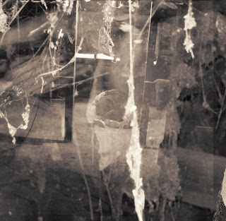
I am now in the process of collating the four images I have made to form the final product and will present it when it is complete.
Monday 31 January 2011
Digipack Design- Inside Left
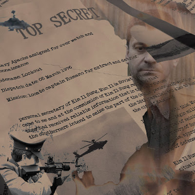
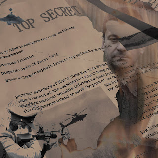
Both the front and back covers of my design so far have predominantly featured the band. Therefore I feel it is necessary to pay more attention actual concept of our video which we convey the message through. The main theme of the video is mostly "military" based and revolves around the central character, who is an ex-army officer who has committed war crimes in the past and wishes to "Die with dignity" (the final line form the chorus of our song). He does this by disposing of some secret documents which reveal information about his past.
For the inside left fold of the digipack I have decided to go for an image which summarises the main character of the video as well as the central themes surrounding him. For the background I have used an image of the "secret documents" which we took during the filming.

I then cropped the image and added a "sepia tone" effect, this will mean that the colour scheme is consistent with the back cover of the album.
The next stage was to add some more images relating to the character. I found several good images in our production stills:
An image of the Officer standing in front of the fire he burns the documents in:

An image of the Officer "taking aim", the same image also appears in the secret documents as well as the video itself.

An image of the apache helicopter, this consolidates the military theme of the text:

To combine these images with the background I used the "lasso" tool to select them and then paste them onto the other image. Using a layer blending option called "Darken" which fades out certain parts of the layers I have managed to make the boundaries between the different parts of the image almost unnoticeable. I then ran the "desaturate" effect. This has made the particularly vibrant colours such as the bright yellows and reds in the fire blend in more easily:
The image seems to work well although it may still be in need of some more improvements. To help get an idea of how effective the combination of the images I have created for the digipack so far will be I have created a prototype. I used an empty CD case and a template downloaded from: http://www.discwizards.com/cd-dvd-artwork-templates.htm This will also allow us to collect audience feedback with more ease.


I have not yet completed the artwork for the inside right, also there would have been no space for it anyway in the format of CD case used.

For the inside left fold of the digipack I have decided to go for an image which summarises the main character of the video as well as the central themes surrounding him. For the background I have used an image of the "secret documents" which we took during the filming.

I then cropped the image and added a "sepia tone" effect, this will mean that the colour scheme is consistent with the back cover of the album.

The next stage was to add some more images relating to the character. I found several good images in our production stills:
An image of the Officer standing in front of the fire he burns the documents in:

An image of the Officer "taking aim", the same image also appears in the secret documents as well as the video itself.

An image of the apache helicopter, this consolidates the military theme of the text:

To combine these images with the background I used the "lasso" tool to select them and then paste them onto the other image. Using a layer blending option called "Darken" which fades out certain parts of the layers I have managed to make the boundaries between the different parts of the image almost unnoticeable. I then ran the "desaturate" effect. This has made the particularly vibrant colours such as the bright yellows and reds in the fire blend in more easily:

The image seems to work well although it may still be in need of some more improvements. To help get an idea of how effective the combination of the images I have created for the digipack so far will be I have created a prototype. I used an empty CD case and a template downloaded from: http://www.discwizards.com/cd-dvd-artwork-templates.htm This will also allow us to collect audience feedback with more ease.


I have not yet completed the artwork for the inside right, also there would have been no space for it anyway in the format of CD case used.

Sunday 30 January 2011
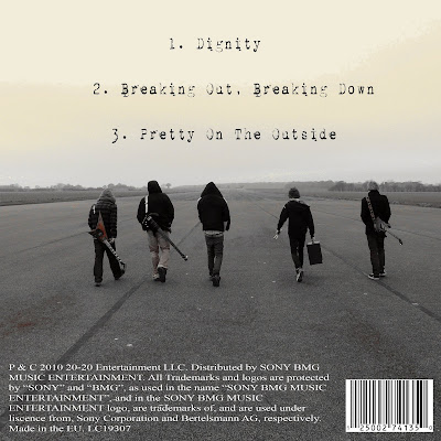
Digipack Design- Back Cover
For the back cover of the digipack we have decided to go with a fairly conventional image which pictures the band. The image I have chosen is one of the band walking with their backs turned to the camera which we took at the runway location. Since the band appear at that same location in the video, the inclusion of this image should help to create a more consistent media product overall which fulfills the sole purpose of the text; to promote the band.

I think it is a very good image because the band are the center as the landscape fades into the distance. Since it is already a very good image I have only made a few slight adjustments. Using the program "Paint Shop Pro 8" I added a "Sepia tone" effect which I feel makes the image more refined.
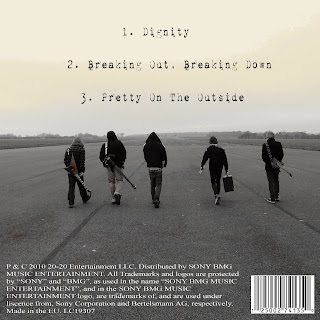
The rest of the editing was done in photoshop however this was mainly used to add the text. For the tracklisting I used the same font which was used for the secret documents, this is another font downloaded online which is known as "1942 typewriter". For my initial draft I have decided to present the digipack in the style of an EP using 3 track names from the album which our song is on. As well as "Dignity", I have also listed, "Breaking Out, Breaking Down" and "Pretty On The Outside" which are two more fairly strong tracks from the album "Fever".
The next 2 features added were two more conventional elements of a digipack, the barcode and the copyright information. For now I have copied the copyright information of the back of the bands 2008 album "Scream, Aim, Fire" changing the date in the process, this should provide a sufficiently accurate representation of what the band would have on the back of an EP. The barcode was rather simply found on Google images, however it certainly looks the part.

I think it is a very good image because the band are the center as the landscape fades into the distance. Since it is already a very good image I have only made a few slight adjustments. Using the program "Paint Shop Pro 8" I added a "Sepia tone" effect which I feel makes the image more refined.
The rest of the editing was done in photoshop however this was mainly used to add the text. For the tracklisting I used the same font which was used for the secret documents, this is another font downloaded online which is known as "1942 typewriter". For my initial draft I have decided to present the digipack in the style of an EP using 3 track names from the album which our song is on. As well as "Dignity", I have also listed, "Breaking Out, Breaking Down" and "Pretty On The Outside" which are two more fairly strong tracks from the album "Fever".
The next 2 features added were two more conventional elements of a digipack, the barcode and the copyright information. For now I have copied the copyright information of the back of the bands 2008 album "Scream, Aim, Fire" changing the date in the process, this should provide a sufficiently accurate representation of what the band would have on the back of an EP. The barcode was rather simply found on Google images, however it certainly looks the part.

Saturday 29 January 2011
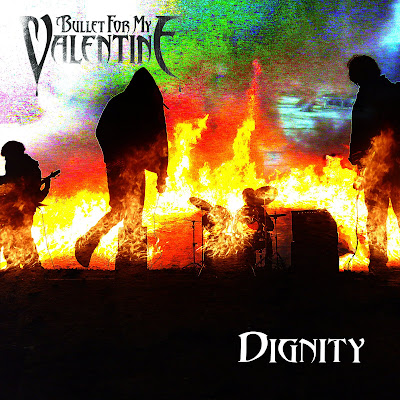
Digipack Design- Front Cover
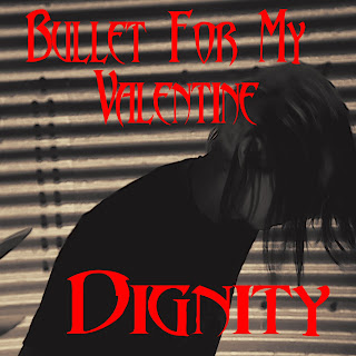
I have now begun work using Photoshop to create the digipack for our single. As discussed in my research the art on a digipack needs to advertise the band as well as the concept which they are trying to put across.
For the front cover of the digipack I initially choose an image of the singer in shadow which was taken in the first band location. I added a sepia tone effect and then the band and song name in a font very similar to that of the bands (called Abbadon):
After some audiance feedback as well as looking at the image in more detail ourselfs we have decided not to use this image; we feel that it does not convey much about the bands message or the single. Additionally size of the text seemed rather out of proportion. For my second draft of the front cover I began with 2 sperate images, one is a production still taken during the filming of the band:

The other was another production still but this time taken while we were filming the bands initials on fire for the introduction.

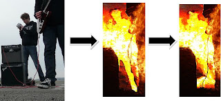
Using Photoshop I combined these two images by pasting the image of the band over the top of the fire and then using an effect called "Colour Dodge" which was one of the effects listed in the "Blending Options" tab in the layer style menu. I then cropped the image into a square shape to fit the conventional dimensions of a digipack. Finally I added the text, using the same font as before. For the bands name I used black and the song title I used white. The main reason for this was because these colours were clearly visible over the image.

You may also notice that the original image contained Andy filming at the time. have done my best to remove him from the image by selecting his profile and decreasing the RBG values fully making it so that only the background of the image of the fire appears in that section for the image. I may have another look at more ways to mask this although hopefully the silhouette should not be very noticeable for people viewing the cover without expecting it.
The main issue with this album cover is that the top right corner of the image is fairly pixelated and undefined, some other parts of this image also have this issue. We may be able to resolve this problem by changing the options during the applying of the layering effect. Although in the meantime we will also gather some audience feedback to see if anything else needs improving.
For the front cover of the digipack I initially choose an image of the singer in shadow which was taken in the first band location. I added a sepia tone effect and then the band and song name in a font very similar to that of the bands (called Abbadon):

After some audiance feedback as well as looking at the image in more detail ourselfs we have decided not to use this image; we feel that it does not convey much about the bands message or the single. Additionally size of the text seemed rather out of proportion. For my second draft of the front cover I began with 2 sperate images, one is a production still taken during the filming of the band:

The other was another production still but this time taken while we were filming the bands initials on fire for the introduction.

Using Photoshop I combined these two images by pasting the image of the band over the top of the fire and then using an effect called "Colour Dodge" which was one of the effects listed in the "Blending Options" tab in the layer style menu. I then cropped the image into a square shape to fit the conventional dimensions of a digipack. Finally I added the text, using the same font as before. For the bands name I used black and the song title I used white. The main reason for this was because these colours were clearly visible over the image.

You may also notice that the original image contained Andy filming at the time. have done my best to remove him from the image by selecting his profile and decreasing the RBG values fully making it so that only the background of the image of the fire appears in that section for the image. I may have another look at more ways to mask this although hopefully the silhouette should not be very noticeable for people viewing the cover without expecting it.
The main issue with this album cover is that the top right corner of the image is fairly pixelated and undefined, some other parts of this image also have this issue. We may be able to resolve this problem by changing the options during the applying of the layering effect. Although in the meantime we will also gather some audience feedback to see if anything else needs improving.
First Draft Of Music Video
Our first draft of our music video is now complete and is uploaded to youtube to recieve auidence feedback and comments on what is good, bad, and can be improved.
Here is our first draft:
Please leave some feedback after watching, thank you.
Here is our first draft:
Please leave some feedback after watching, thank you.
Sunday 23 January 2011
Started Using Wix To Create Band Web Page
For one of our ancillary tasks we have to design a website homepage for our band. We are going to do this using Wix.com, a site which allows you to create your own websites for free.
Wix has lots of pre-made templates that you can use for your own. After looking through many different templates I decided that it would be better to create our own page from scratch as there weren't any templates that I felt had the correct look for the genre and style of music that our music video is.
I started with a plain black background and added a smoke affect overlay. I then took the band's album cover "Fever" (which is the album from which our music video song choice is taken) and added a gradient fade to black to use as a background for the area's where text, links, photos, videos etc will be displayed on the web page.
I then added the Band's logo to the top of the page, this is of the band's name "Bullet For My Valentine" in their signature font. Below is a picture of this work so far.

I will blog more as I finish creating each section of the website.
Thursday 20 January 2011
Using Photoshop.
As well as editing our preliminary task we have also been looking into production techniques for ancillary tasks. Both the webpage and digipack will require photo editing techniques, for this we have chosen to use Adobe Photoshop. We have explored some of the numerous functions of Photoshop by testing it out on a few generic images such as a picture of the earth.
Today we have learn how to use functions such as the various different methods of selecting part of an image the simplest of these is the option allowing you to select a specific shape, the different presets include the simple box and oval shapes. For more specific selections the magic wand tool can be used this selects an area of an image of a similar colour to the chosen pixel. A good feature of this is the ability to change the threshold level which effectively changes the sensitivity of the selection. For example if it is high only pixels exactly the same would be added to the selection and if it is low a great deal of the image is likely to be added.
Another selection tool is the “Lasso” which allows you to select part of an image freehand; this is likely to come in useful in situations where the colour of an image does not change sufficiently. The downside to this function is the fact that it requires a very steady hand to select the edges of even fairly simple shapes and it is easy to slip.
When part of an image is selected it is possible to perform a variety of transformations such as distortions and rotations these can be found in the “Edit” menu. So far we have mainly used these for selections although they can also be used for changing the apparent orientation of a selection; however we have found that using this can cause parts of an image to pixelate so we will have to be careful about not applying distortion type effects too vigorously.
Additionally a selected image can have various effects applied to it, many of these involve editing the RGB balance or the saturation, for example turning the saturation down to its lowest value will make an image appear in its “greyscale” black and white form. Another useful feature is the fact that Photoshop works in layers meaning that a given transformation or effect can be applied to only a single layer of an image, this allows the editor to have much more control over the image being produced. The layers can be toggled between and also viewed as a single image, if the overall image is then saved and re-imported it can even be used as another layer of an even more complex image.
So far we have only scratched the surface when it comes to all the features of Photoshop; however I am sure that once we have a little more experience it will allow us to create some very effective imagery for our digipack and webpage.
Friday 14 January 2011
Solution to problem with imported footage
Hey guys, as you may have read in the previous post by Matt we had some problems when we imported the footage as the first narrative part was filmed on the different camera meaning the footage was not shot in wide screen. This meant that when we added the footage to the timeline in final cut, there where black bars either side of the footage for the first narrative.
However after experimenting with changing different properties of the footage to fix this problem, we found that when we changed the scale of the footage to 103 instead of the standard 100, final cut would then take this new aspect ratio and fit it to the same size as the wide screen footage from the other camera. We exported a test shot to make sure that it would appear like this in when exported to quick time, and although the footage is stretched (to make wide screen), the stretch is barely noticeable without looking really close, and is not pixelated or distorted in anyway.
Now that we have resolved this problem we can carry on editing of our music video, so far we have just over a minute of footage editing together and synced with the music.
Thursday 13 January 2011
Editing
We have now finished importing our footage and have begun the editing process using Final Cut Pro. It is new to both of us since we used imovie for our previous productions so we are having to learn how to make use of its features as we go. So far we have found it a lot more efficient for dealing with a relatively large project such as a music video. For example the clips can be arranged into individual folders known as "Bins", this has been useful since we have several different narrative strands as well as 2 locations for the band; so we have been able to arrange them.
Another useful feature is the way that the program makes a copy of your clip when you drag it from a folder down to the timeline, this means that it is significantly easier to use more than one section of film from a single film clip since you never have to crop a clip indefinitely. The dual viewing windows are also an effective tool for cutting clips at exactly the right time since they allow us to coordinate the sound in one project with the video in the other.
One setback we have had is that the footage we filmed for part of the narrative with the soldier running through the forest and killing the refugee was filmed on a different camera to the rest of the footage. The majority of the footage was filmed on a camera with a widescreen aspect ratio, whereas the footage from the other camera is much closer to a square. We are going to see if we can find a way to convert it to the right aspect ratio, if not we may have to cut that part of the narrative out entirely. We will have enough footage to replace it however we may have to change the order of things slightly.
Friday 7 January 2011
Risk Assessment
During the production of our video we had to take into account the potential risks of filming around and preparing the scene with the bands initials in fire. During our filming we made sure to keep away from the flammable liquids used while my Dad who is responsible and has more experience poured them. For the shots of the petrol being poured we actually used a can filled up with water, the difference is almost unnoticeable and this avoided the danger of unnecessarily spilling petrol.

We also made sure to try out our idea for the bands initials on fire with smaller amounts of different flammable liquids to find the safest and most effective. Additionally for some of the filming we made use of the zoom function on the camera, this way we didn’t have to as close to a naked flame; however we didn’t zoom too much since this would have compromised the quality of film.

We also had to careful to keep clear during the scenes with vehicles driving in and to make sure the platforms we used for our high angle shots such as the back of the truck and the first few steps of a ladder were stable and secure.
Thursday 6 January 2011
Beginning of editing
Hi everyone, I decided as I hadn't posted anything in a while i'd just a leave a quick post telling you guys of our progress.
We have now started to import the footage to the Macs at sixth which is taking a bit of time as we have just under 2 hours total footage. Once it is all imported we will sort through and remove any clips that are unusable either due to actor errors or filming errors such as objects visible in the corner of shot that shouldn't be. Once we have gone through and picked out the best footage from our narrative and performance we will beginning editing them using Final Cut Pro.
We have now started to import the footage to the Macs at sixth which is taking a bit of time as we have just under 2 hours total footage. Once it is all imported we will sort through and remove any clips that are unusable either due to actor errors or filming errors such as objects visible in the corner of shot that shouldn't be. Once we have gone through and picked out the best footage from our narrative and performance we will beginning editing them using Final Cut Pro.
Tuesday 4 January 2011
Filming Part 4
We have now finished the filming for our production and should have enough footage to put together the complete product; especially since we have filled up 2 tapes. Today we filmed the band playing outside at the runway location. The weather was overcast which did not provide the best light possible, however the lighting should be sufficient as well as consistent.

During the filming we used a mixture of handheld and fixed shots to obtain the largest variety of shot types as possible; we even shot with the tripod on the back of a truck to get a good high-angle shot.


We also filmed the torture scene part of the narrative, It was difficult to capture all the shots we wanted since the location only had one good room to use but what we have should be sufficient when combined with the rest of the footage.

Subscribe to:
Posts (Atom)